
How to Make AI PowerPoint Videos Look Less Like PowerPoint

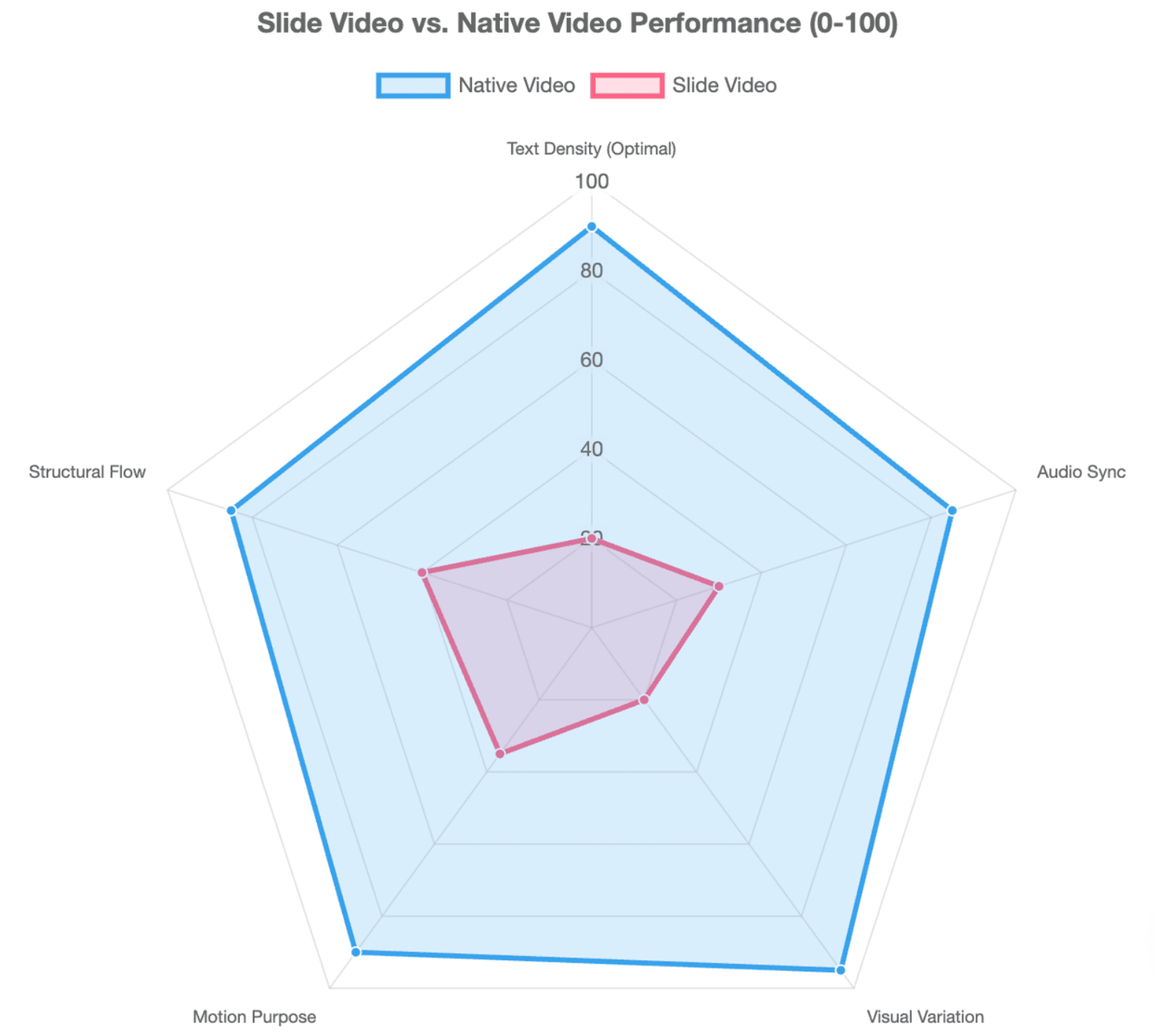
AI PowerPoint videos often still look like PowerPoint because the workflow preserves the slide instead of redesigning the information for video. Even with AI narration, avatars, and transitions, the result can still feel like a slideshow when every slide becomes one scene and the narrator simply reads what is already on screen.
A better approach is to treat PowerPoint as source material and rebuild its ideas into scenes, narration, motion graphics, real visuals, and purposeful transitions. Leadde supports this kind of workflow by analyzing the content logic, key information, section structure, and narrative flow inside PowerPoint files before generating structured video scenes, scripts, narration, and visuals.
This guide explains how to break the one-slide-one-scene pattern, improve narration and visuals, use motion more intentionally, and make the final result feel edited as a video rather than exported from a deck.

AI PowerPoint Videos: Why Do They Still Look Like PowerPoint?
The strongest PowerPoint fingerprint is usually structural, not cosmetic. Changing the template or adding more transitions will not fix a video that still follows slide logic.
One Slide Becomes One Scene
Many conversion workflows effectively produce:
Slide 1 → Scene 1 → Slide 2 → Scene 2 → Slide 3 → Scene 3
That preserves the deck rather than directing a video.
A slide may contain several separate ideas that deserve multiple visual beats. Conversely, three thin slides may work better as one continuous sequence.
Repeated Layouts, Generic Visuals, and Read-Aloud Narration
AI-generated presentations have recognizable defaults: repeated card layouts, centered titles, generic imagery, decorative icons, and identical visual rhythm. Current presentation-design guides identify these patterns as common reasons AI output feels generic.
The problem becomes more obvious in video when the same scene repeats for minutes:
avatar + slide → avatar + slide → avatar + slide
Practitioner discussions also point to excessive text, generic headings, and repeated layouts as obvious signs of automated presentation production.
The Deeper Problem Is Slide Logic
You can replace the background, add cinematic B-roll, and animate every bullet. If the story still progresses as:
Title → bullets → next topic → bullets → conclusion
the result remains a presentation with motion.
The first goal is therefore not to make PowerPoint move more. It is to decide what the information should become once it enters a video timeline.
How Should You Turn PowerPoint Slides Into Video Scenes?
A useful rule is:
Preserve the meaning of the deck, not the layout of the deck.
One Slide Does Not Have to Equal One Scene
Start by identifying the narrative beat behind each slide. Then decide whether it needs one scene, several shots, or should be combined with neighboring material.
For example, a slide called “Why Training Content Becomes Outdated” might contain four bullets about product changes, policies, screenshots, and localization.
Instead of showing those four bullets, turn them into four beats:
- Show an existing training resource.
- Show the product interface changing.
- Highlight how the old training visual no longer matches.
- End with one takeaway about the update problem.
The original slide supplied the information; it did not dictate the video composition.
Use a Slide-to-Video Transformation Matrix
| PowerPoint content | Avoid | Better video treatment |
| Bullet list | Animated bullets | Sequential visual beats |
| Process diagram | Static full-screen diagram | Animated process |
| Chart | Showing every number at once | Focused data story |
| Screenshot | Full-page screenshot | Guided UI close-up |
| Comparison | Two text-heavy columns | Split-screen contrast |
| Case study | Generic stock image | Mini visual narrative |
From an instructional design perspective, this decomposition matters because viewers process information over time. Storyboarding before production also helps establish a coherent visual sequence rather than improvising slide by slide. Descript similarly recommends planning a storyboard before building the presentation video.
Build the Static Logic Before Adding Motion
Before animating anything, look at the storyboard as static frames.
Ask:
Does each scene communicate one clear idea without relying on decorative movement?
If not, animation will rarely solve the underlying problem.
How Should You Rewrite Slide Text and Narration for Video?
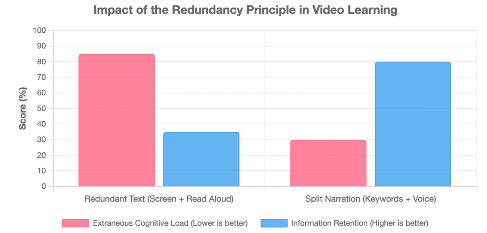
Presentation copy is written to be scanned. Video narration is written to be heard. They should not be identical.
Let Narration Explain While On-Screen Text Signals
A useful division of labor is:
| Channel | Job |
| Narration | Explain |
| On-screen text | Signal |
| Visual | Demonstrate or prove |
| Real-world situation | B-roll |
| Abstract concept | Diagram |
| Short definition | Kinetic typography |
| Human explanation | Avatar or presenter |
Descript describes a similar distinction: slides provide structure while the voice carries the argument.
This also aligns with multimedia-learning research. The redundancy principle warns that unnecessary duplication of the same information across narration and visible text can add cognitive load rather than help learning.
So instead of placing a paragraph on screen and reading it aloud, move the explanation into narration and keep only the key phrase, number, or visual cue visible.
Replace Topic Titles With Takeaway Titles
Generic AI titles describe categories:
Employee Training Challenges
A stronger title communicates the point:
Training content becomes expensive when every update requires rebuilding the video
This change adds a human editorial perspective. Current AI-presentation guidance similarly recommends grounding AI in real material and giving each slide a specific point of view rather than accepting generic generated language.
Write for the Ear—and Connect Scenes Conceptually
Avoid a script full of:
“Next…”
“Now let's look at…”
“Another benefit is…”
Instead, let one idea create the next:
“The problem is not creating the first training video. It is keeping hundreds of videos current when the product changes.”
Now the next scene has a reason to exist.
A good transition is first conceptual, then visual.
What Visuals and Motion Make an AI PowerPoint Video Feel Like Real Video?
Not every slide should become B-roll, and not every concept needs an avatar. Choose the visual form based on what the information needs to communicate.
Match the Visual Format to the Information
| Information Type | Recommended Visual Format | Why It Works |
| Software steps / How-to | Screen recording / UI close-up | Provides concrete proof of action |
| Abstract relationships | Animated diagram / Motion graphics | Maps out invisible connections |
| Emotional appeal / Context | Real footage / Purposeful B-roll | Humanizes the narrative |
| Data and comparisons | Animated charts | Reveals trends over time |
For SaaS training, for example, a real interface close-up usually explains a product step better than footage of someone typing on a laptop.
Use Evidence Visuals, Not Decorative B-Roll
Consider two visuals for the statement:
“Training screenshots become outdated after a product redesign.”
An atmosphere visual might show employees working in an office.
An evidence visual can show:
old interface → new interface → outdated training screenshot
The second visual participates in the explanation.
Use a simple test:
Does this visual provide evidence, context, or explanation?
If not, it may be moving wallpaper.
Use Motion to Explain Relationships
Avoid animating objects simply because animation is available.
Instead, animate relationships:
- before → after
- cause → effect
- whole → detail
- step → next step
- comparison → difference
Progressive disclosure is especially useful: reveal information when the narration reaches it instead of displaying the complete slide from the first frame.
For generative footage, shot language also matters. OpenAI's Sora prompting guidance recommends treating shots as distinct creative units, specifying framing and action, and keeping motion relatively simple—for example, one clear camera movement and one clear subject action. It also notes that concise shots can be easier to control than longer ones.
That is a fundamentally different mindset from choosing a PowerPoint transition.
How Do You Create Scene Variety Without Making the Video Feel Inconsistent?
Professional video needs both variation and continuity.
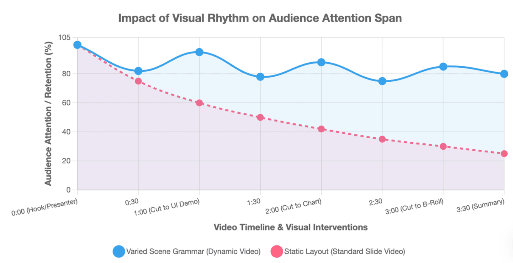
Vary Scene Grammar, Not Just Slide Layouts
Instead of changing from one slide template to another, vary the way the information is communicated:
Presenter → UI demo → diagram → B-roll → chart → detail shot → presenter
This produces visual rhythm without forcing every idea into the same rectangular composition.
Build a Video Design System
A PowerPoint brand kit usually defines colors, fonts, and logos. A video system should go further:
- caption style
- motion behavior
- transition philosophy
- chart animation
- illustration treatment
- avatar styling
- B-roll treatment
- audio tone
The principle is:
Layouts change. Visual language stays consistent.
OpenAI's video guidance similarly recommends keeping lighting logic, descriptive details, and palette anchors consistent when clips need to cut together coherently.
Use AI Avatars Selectively
Avatars work well for openings, transitions, explanations, and summaries. They are less useful when viewers need to inspect a chart, process, product interface, or detailed diagram.
An avatar is a presentation mode, not a universal video layout.
If the avatar remains beside a static slide throughout the entire video, you have changed the presenter—not the storytelling format.
What Human Editing Pass Makes an AI PowerPoint Video Look Finished?
AI generation should produce editable material, not remove editorial judgment.
Cut, Merge, and Split Scenes Based on Meaning
Review the first cut and:
- remove scenes that only repeat narration;
- merge scenes with too little information;
- split overloaded scenes;
- replace generic B-roll;
- reduce repeated avatar layouts;
- check factual claims and data.
This is also why source-grounded document-to-video workflows matter. Leadde's documented workflow analyzes information hierarchy and narrative flow rather than simply placing text into templates, giving teams a more structured starting point for training, education, product explanation, and knowledge videos.
Check Scene-to-Scene Continuity
Ask after every scene:
Why does this lead to the next one?
Community discussions around AI presentation workflows repeatedly highlight that a deck can contain individually acceptable slides yet still feel obviously generated when several pages lack a coherent progression.
Use the Three-Test QA Model
Before publishing, run three simple checks:
Thumbnail Test: View every scene as small storyboard thumbnails. If most frames have the same composition, the video still has slide rhythm.
Mute Test: Watch without sound. The visuals should communicate meaningful information rather than merely decorate the narration.
Audio-Only Test: Listen without watching. The argument should flow naturally instead of sounding like a list of slide headings.
The goal is simple: the final video should feel edited, not exported.
Conclusion
Making an AI PowerPoint video look less like PowerPoint is not about adding more animations. Treat the deck as knowledge, redesign that knowledge as scenes and shots, let narration and visuals do different jobs, choose media based on the information, and use motion to guide attention over time. That is what turns a converted presentation into a video-first communication experience.